.png)
Medistant: Simplifying Medication Management
Medication adherence poses a significant challenge, often affecting health outcomes and increasing healthcare costs. Medistant addresses this issue through an intuitive app for tracking and managing medications. This case study explores its development, highlighting user-centered design and innovative solutions.
8 minutes

“Drugs don't work in patients who don't take them.”
C. Everett Koop, pediatric surgeon
Project Overview
Medication adherence remains a critical challenge in chronic disease management, often leading to poor health outcomes and increased healthcare costs. Medistant was envisioned to simplify this process by providing an intuitive mobile application that helps users track, manage, and adhere to their prescribed medication regimens. This case study outlines the journey of developing Medistant, focusing on user-centered design and innovative technology to address real-world healthcare challenges.
My Role
As the lead designer and project lead for Medistant, my responsibilities included:
-
Conducting in-depth research on user needs and market trends.
-
Designing user personas and customer journey maps.
-
Creating the app's visual identity, including its logo and UI elements.
-
Leading the prototyping phase to refine user interactions and prioritize accessibility.
-
Developing a comprehensive design system for consistency and scalability.
Project Objectives and Challenges
The Medistant project aimed to tackle the widespread issue of non-adherence to therapy among patients with chronic illnesses, where adherence rates hover around 50%. The app sought to empower users by prioritizing a Patient-Oriented Approach, focusing on their needs, behaviors, and challenges. The primary goal was to design a solution that improves adherence metrics while addressing barriers such as forgetfulness, complex medication regimens, and lack of understanding. A critical challenge was simplifying the user experience while maintaining robust functionality to serve a diverse audience.
Design Process
The design process for Medistant followed the Double Diamond Framework, ensuring a user-centric solution. By identifying pain points through in-depth research and employing a Patient-Oriented Approach, the Define stage prioritized features that addressed real-world challenges. Simplicity and usability were key considerations during the Develop phase, resulting in prototypes that underwent iterative refinement through user testing. This process culminated in a final Deliver phase where the app’s intuitive design aimed to foster better medication adherence and patient empowerment.

Stage 1.
Conducting Research
The research phase was integral to the success of Medistant, shaping the app to address real-world challenges with evidence-based decisions. This stage involved a combination of user-centered methodologies and market analysis to ensure that every feature served a clear purpose.
Market Research
The market research began with an analysis of the broader healthcare landscape, focusing on trends in medication adherence and the adoption of mobile health applications. It revealed that approximately 34% of adults in Bulgaria use health apps monthly, a figure projected to increase with the ongoing digitalization of healthcare. Chronic conditions such as hypertension and diabetes emerged as key factors driving the need for effective medication management, alongside a growing demand for solutions addressing temporary medication schedules.
These insights highlighted the need for simplicity, accessibility, and scalability in Medistant’s design, ensuring it could accommodate both chronic and temporary medication needs while adapting to diverse user demographics.
Adherence Metrics Evaluation
To evaluate the app's impact, adherence metrics commonly used in clinical and research settings were analyzed. Tools such as the Morisky Medication Adherence Scale (MMAS) and adherence rate formulas (targeting ≥80% adherence) provided insights into the complexities of tracking user engagement. Key behaviors, such as "White Coat Adherence," where users temporarily improve adherence before medical appointments, were identified as critical challenges. This analysis guided the design of features aimed at fostering long-term behavioral change rather than merely encouraging short-term compliance.
Surveys and Interviews
Armed with insights from market research, we engaged directly with users through surveys and interviews. Questions like "How often do you forget to take your medications?" and "What features would make managing your regimen easier?" helped us uncover valuable insights. Participants frequently cited forgetfulness, confusion over instructions, and fear of side effects as barriers to adherence.
Interviews revealed subtle nuances, such as elderly users' reliance on family for medication reminders and working professionals’ preference for discrete notifications during meetings. This data drove the prioritization of customizable reminders and user-friendly interfaces in the app.
Behavioral Insights
An analysis of user behaviors revealed two primary drivers of non-adherence: intentional and unintentional factors. Intentional non-adherence, such as skipping doses due to concerns about side effects, highlighted the need for features like side-effect tracking and educational content. Unintentional non-adherence, often resulting from forgetfulness or busy schedules, underscored the importance of intuitive reminders and user-friendly interfaces. These findings shaped the app's core design philosophy: to provide support without judgment.
Competetitive Analysis
The analysis shows that most medication apps either focus on simplicity but lack advanced tools or offer comprehensive features that overwhelm users. Usability and accessibility remain key challenges, especially for elderly users. There is a clear gap for a solution that balances essential features with an intuitive and user-friendly design.

User Persona: Maria
Maria is a 69-year-old retiree who enjoys her quiet rural lifestyle, spending most of her time gardening. She recently started managing a new medication regimen for hypertension, which she finds challenging to remember and follow. Maria values simplicity and independence but often forgets doses due to the complexity of her schedule and limited access to pharmacies. She needs a straightforward and supportive tool to help her stay on track with her medications and maintain her health without added stress.
.jpg)
Empathy Map: Maria
The goal of Maria's empathy map is to understand her challenges and emotions around managing medications, ensuring solutions are simple, supportive, and empower her independence.

User Persona: Alex
Alex is a 35-year-old real estate agent balancing a demanding career and a busy personal life. He often struggles to integrate health routines into his unpredictable schedule, resulting in missed medications and neglected health goals. Tech-savvy and efficiency-driven, Alex seeks a seamless solution that fits into his fast-paced lifestyle, providing discreet reminders and tools to help him stay organized without disrupting his day.
.jpg)
Empathy Map: Alex
Alex's empathy map aims to uncover how his busy lifestyle impacts his health routines, guiding the design of tools that seamlessly integrate into his daily life.

Stage 2.
Sketching Potential Solutions
Building on research insights, I created low-fidelity sketches to visualize user flows and key features, focusing on simplifying medication management. These sketches explored processes like registration, setting reminders, and tracking progress, ensuring an intuitive and user-friendly design. By iterating on ideas, I laid the foundation for a solution that balances simplicity and functionality, addressing real user needs effectively.

Wireframes
These wireframes take the ideas from the initial sketches and distill them into more refined, low-fidelity designs. They focus on visualizing the app’s core functionality, including onboarding, adherence tracking, and medication management. By prioritizing simplicity and usability, the wireframes serve as a bridge between the exploratory sketches and the final design.
.jpg)
Stage 3.
Designing the Solution
With the research insights and user flows in place, I transitioned into the design phase to bring Medistant to life. I started by creating a logo that symbolizes trust, care, and reliability, reflecting the app's mission to support users in managing their health. Following this, I focused on developing a clean and intuitive UI/UX design that caters to the diverse needs of users like Maria and Alex. Emphasizing simplicity, accessibility, and user-centered interactions, the design aimed to deliver a seamless experience, helping users stay on track with their medications while building confidence in their health management journey.
Logo Design
The name of the app, Medistant, was thoughtfully crafted to capture the essence of its functionality—MEDIcation assiSTANT or MEDIcation inSTANT—conveying both support and immediacy. The logo features a sleek, minimalist design with a circular icon and a diagonal cut, evoking the image of a tablet. This clean and modern visual identity reflects the app's core values of reliability, health, and balance, while ensuring memorability and clarity. Paired with the slogan, “Stay in Sync. Your health, our reminders,” the logo reinforces Medistant's commitment to helping users stay on track with their health in a simple and effective way.

Medistant's Dashboard – Your Health at a Glance
These screens highlight Medistant's intuitive dashboard, offering a clear overview of daily adherence, upcoming medications, and missed doses. Designed for simplicity, the interface empowers users to manage their health with ease and confidence.
.jpg)
Never Miss a Dose
Stay on track with your medication schedule effortlessly. When it's time to take your meds, you'll receive a timely notification. Simply tap it to see a pop-up with all the details—medication name, icon, and a visual day tracker. You can choose "Take" or "Skip" with just one tap. If you miss a dose, it’s recorded in your dashboard, and you can easily mark it as taken later with options like "Now," "On Time," or "Adjust Time." Once confirmed, the "Take" button turns into "Undo," giving you complete control and peace of mind.

Effortlessly Manage Your Meds
Stay on top of your health with clear and actionable insights. The "Analytics" section offers detailed reports of your medication intake, organized by week, month, or year, helping you track adherence effortlessly. Dive into specific days to see detailed logs, including taken or missed doses, times, and medication details. The "Profile" section provides quick access to personal settings, privacy options, and support, ensuring everything you need is right at your fingertips.

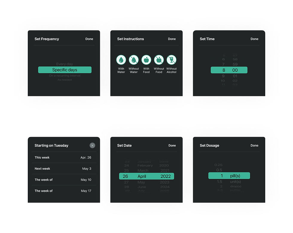
Adding New Medications Easily
Adding your medications has never been simpler. Just tap "Add Medication" or the plus icon, and follow a streamlined, five-step process. First, search for your medication or scan the bottle using your phone's camera. Next, select its form—whether it's a pill, injection, liquid, or inhaler. Set how often you take it, from daily schedules to as-needed doses. Customize the timing and dosage for each intake, and finally, review all the details on a summary card. You can even set reminders, track supply, and adjust specific intake instructions.

Enhancing Accessibility and Usability in the "Medications" Tab
The redesign of the "Medications" tab focused on improving both functionality and accessibility to deliver a seamless user experience. Initially, medications were represented with circular icons that, while visually cohesive with the app's branding, proved inadequate for users with complex medication regimens. To address this, the design transitioned to vertically stacked cards that offer detailed information for each medication, simplifying navigation and management. Additionally, text contrast issues were resolved by switching from white to black text on the green background, significantly improving readability and meeting accessibility standards. These changes highlight how usability enhancements can take precedence over aesthetic consistency to prioritize user needs.
.jpg)
Stage 4.
Building the Medistant UI Design System
To ensure consistency and scalability throughout the Medistant application, a comprehensive design system, Medistant UI, was developed and organized into a centralized hub using ZeroHeight. This system incorporates a responsive design strategy and clear guidelines to maintain visual and functional harmony across devices. The main components—such as UI icons, cards, buttons, pop-ups, and other essential interface elements—serve as the foundation of Medistant's user experience. By standardizing these elements, the design system facilitates seamless collaboration, enhances accessibility, and delivers a cohesive experience for users across all screens.
Conclusion
The development of Medistant was guided by a deep understanding of user needs, a commitment to accessibility, and a focus on creating a seamless and engaging experience. From initial research and sketching to crafting the Medistant UI design system, every stage was carefully executed to address the challenges of medication management. This case study demonstrates the importance of aligning design with real-world problems, resulting in a solution that not only meets but exceeds user expectations. Medistant is more than just an app—it’s a step toward better health outcomes and a testament to the power of thoughtful design.


UI Icons
The UI icons in Medistant were designed to enhance usability and create a visually intuitive experience. Each icon follows a minimalist style, ensuring clarity and quick recognition, while aligning with the overall design system. These icons serve as visual anchors, guiding users seamlessly through the app’s features and interactions, from medication management to profile settings.

Cards
The Medistant UI cards present essential information in a clear and organized manner. These vertically stacked cards provide users with detailed medication data at a glance, including dosage, frequency, and timing. By combining functionality with simplicity, the cards ensure users can easily manage their medication regimens, enhancing both usability and accessibility within the app.

Components
The components in Medistant UI were designed as versatile building blocks to ensure a cohesive and responsive user experience. From buttons and toggles to input fields and pop-ups, each component adheres to the design system’s guidelines for accessibility, functionality, and simplicity. These reusable elements streamline development and maintain visual consistency across all screens, ensuring a seamless interaction for every user.

Buttons
The buttons in Medistant UI are designed to be intuitive, accessible, and visually consistent. Each button features clear labels, high contrast, and responsive states to guide users seamlessly through the app. Whether it’s confirming a medication intake or navigating to another section, the buttons ensure effortless interaction while maintaining the overall simplicity and usability of the design system.
Pop-ups
Pop-ups provide users with timely and concise information, ensuring minimal disruption to their workflow. Whether it’s a medication reminder, confirmation message, or alert, each pop-up is visually consistent and easy to read. By balancing clarity and functionality, these elements enhance the user experience, delivering important updates precisely when they’re needed.
Based in Plovdiv, Bulgaria.
Let's get in touch at info@sladurada.com

UI Icons
The UI icons in Medistant were designed to enhance usability and create a visually intuitive experience. Each icon follows a minimalist style, ensuring clarity and quick recognition, while aligning with the overall design system. These icons serve as visual anchors, guiding users seamlessly through the app’s features and interactions, from medication management to profile settings.
Cards
The Medistant UI cards were designed to present essential information in a clear and organized manner. These vertically stacked cards provide users with detailed medication data at a glance, including dosage, frequency, and timing. By combining functionality with simplicity, the cards ensure users can easily manage their medication regimens, enhancing both usability and accessibility within the app.
Components
The components in Medistant UI were designed as versatile building blocks to ensure a cohesive and responsive user experience. From buttons and toggles to input fields and pop-ups, each component adheres to the design system’s guidelines for accessibility, functionality, and simplicity. These reusable elements streamline development and maintain visual consistency across all screens, ensuring a seamless interaction for every user.
Buttons
The buttons in Medistant UI are designed to be intuitive, accessible, and visually consistent. Each button features clear labels, high contrast, and responsive states to guide users seamlessly through the app. Whether it’s confirming a medication intake or navigating to another section, the buttons ensure effortless interaction while maintaining the overall simplicity and usability of the design system.
Pop-ups
Pop-ups in Medistant UI are designed to provide users with timely and concise information, ensuring minimal disruption to their workflow. Whether it’s a medication reminder, confirmation message, or alert, each pop-up is visually consistent and easy to read. By balancing clarity and functionality, these elements enhance the user experience, delivering important updates precisely when they’re needed.